
A flyer has about three seconds to earn attention. Someone glances at a bulletin board, a counter or a handout, decides whether it is relevant, and either reads on or moves past. Most flyers lose that moment because they try to say everything at once: a crowded page of text, five fonts, a logo that is bigger than the offer and no clear reason to act.
This guide explains how to design a flyer for business that people actually respond to. You will learn how to plan the message, structure the layout, write a headline and call to action, choose images, fonts and colors, prepare the file for printing, and test which version performs best. The same principles apply whether you design in a free online tool or hand the job to a designer.

Start with one goal and one reader
Before you open any design tool, answer two questions in a single sentence each:
- What do I want people to do? Call to book, visit this Saturday, scan for the menu, register for the event, bring the flyer in for a discount.
- Who is the flyer for? Office workers grabbing lunch, parents near a school, homeowners in one neighborhood, visitors at a trade show.
If you cannot answer both clearly, the flyer will not be clear either. A flyer that tries to promote your whole business usually promotes nothing. One flyer, one goal, one audience.
The anatomy of a flyer that works
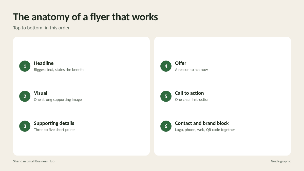
Effective flyers follow a predictable order, from top to bottom:
- Headline: The biggest text on the page. It states the benefit or the offer.
- Visual: One strong image that supports the headline.
- Supporting details: Three to five short points or one short paragraph covering what, when, where and why.
- Offer: A discount, free item, limited-time deal or event detail that gives a reason to act now.
- Call to action: One clear instruction, such as “Call to book,” “Scan to reserve” or “Visit us this Saturday.”
- Contact and brand block: Logo, address, phone, website and QR code, grouped together at the bottom.
Readers scan rather than read. If someone sees only the headline and the call to action, they should still understand what you want.
Write a headline that earns the next line
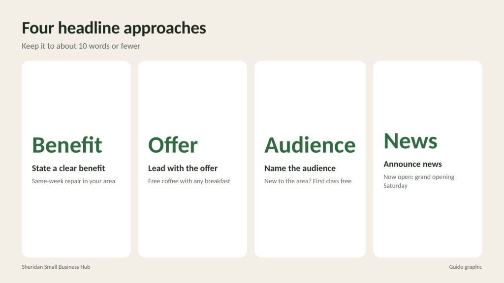
Your headline is the single most important part of the flyer. Strong headlines usually do one of these:
- State a clear benefit: “Same-Week Furnace Repair in Your Neighborhood”
- Lead with the offer: “Free Coffee With Any Breakfast This Week”
- Name the audience: “New to the Area? Your First Class Is Free”
- Announce news: “Now Open on Westheimer: Grand Opening Saturday”
Avoid putting your business name as the headline unless the name itself is the news. People care first about what is in it for them. Keep the headline to roughly 10 words or fewer, and make sure it can be read from several feet away.
Layout rules that keep a flyer readable
Use a clear visual hierarchy
Size tells readers what matters. The headline should be clearly larger than everything else, the offer second, details third. If everything is bold and large, nothing stands out.
Leave white space
Empty space is not wasted space. Margins and breathing room around text make a flyer look professional and easier to read. A good test: if the flyer feels crowded, remove something rather than shrinking the text.
Align everything
Pick a consistent alignment, usually left-aligned text with a clear edge, and stick with it. Random placement makes a page feel messy even when the content is good.
Group related information
Keep the date, time and location together. Keep contact details together. Readers find what they need faster when related items sit side by side.
Fonts, colors and images
- Fonts: Use two at most, one for headlines and one for body text. Choose clean, readable typefaces and avoid decorative scripts for anything important like phone numbers.
- Colors: Use your brand colors plus one accent color for the offer or call to action. Make sure text contrasts strongly with its background. Dark text on a light background is the safest choice.
- Images: One large, sharp, relevant photo usually beats a collage of small ones. Show the product, the result or people enjoying the service. Use your own photos or properly licensed images, never pictures copied from a search engine.
- Logo: Include it, but keep it modest in size. Your logo identifies you; it does not sell for you.
Calls to action and QR codes
A flyer without a call to action is just decoration. Make yours specific and easy:
- Use an action verb: call, book, scan, visit, register, bring.
- Add a reason to act soon: a date, a limited quantity or a seasonal offer.
- Give one primary action rather than four equal ones.
If you add a QR code, tell people what they get by scanning, such as “Scan for this week’s specials.” Point it to a mobile-friendly page that matches the flyer’s offer, not just your home page. Print the code large enough to scan easily and test it with more than one phone before printing the full run.
Prepare the file for printing
A well-designed flyer can still print badly if the file is not set up properly. Before sending it to print:
- Choose a standard size. Letter size (8.5 x 11 inches) and half-letter (5.5 x 8.5 inches) are common for flyers and easy to post or hand out.
- Add bleed if colors or images run to the edge, and keep text inside a safe margin. Ask your printer for their exact bleed and margin requirements.
- Use high-resolution images, around 300 pixels per inch at final printed size.
- Export a print-ready PDF with fonts embedded.
- Proofread every detail. Check phone number, address, dates, prices and web address. Then have someone else check them.
- Print one test copy to check colors, readability and QR scanning before ordering the full quantity.

Test and improve your flyer
The best way to improve a flyer is to compare versions. Print two designs that differ in one element, such as the headline or the offer, and give each its own code or QR link.
Worked example: you print 250 copies of Version A with the headline “20% Off Your First Visit” and 250 copies of Version B with “Your First Class Is Free.” Version A brings in 10 responses and Version B brings in 18. Response rates are 10 / 250 = 4 percent and 18 / 250 = 7.2 percent. Version B wins, so it becomes your new standard, and your next test changes a different element, such as the image.
Keep notes on every test. Over a few rounds, you build a clear picture of what your local customers respond to.
Mistakes that quietly kill responses
- Tiny contact details. If the phone number is hard to read, people will not squint to find it.
- Expired offers left on display. Replace posted flyers when the date passes, or the business looks inattentive.
- Light text on busy photos. It looks stylish on screen and becomes unreadable in print.
- No way to track results. Without a code or dedicated link, you cannot tell a winning flyer from a weak one.
Frequently asked questions
What should be included on a business flyer?
A clear headline, one strong image, a few supporting details, a specific offer, a single call to action and your contact information grouped together.
How much text should a flyer have?
As little as possible. A headline, three to five short points and contact details are usually enough. If it needs paragraphs, consider a brochure instead.
What is the best size for a flyer?
Letter size works well for posting on boards and windows. Half-letter is cheaper to print in volume and easier to hand out.
Should a flyer be printed in color?
Color usually draws more attention, especially for photos and offers. Black and white can work for simple notices if the layout and contrast are strong.
Flyer design ready for print?
Bring your print-ready PDF and get a test copy before the full run. The Postal Spot’s printing and copy center in Houston handles flyers, posters and banners for local businesses.