
A business card has one job: make it easy for someone to contact you later. Yet many cards end up in a drawer or the trash because the phone number is too small to read, the website is missing, or the design looks like it came from a different company than the one the person just met. The most common business card design mistakes are small, but each one quietly costs you calls, emails and referrals.
This guide covers the mistakes that matter most, why each one hurts, and how to fix it before you send a file to print. You will also find a checklist you can run through in five minutes, plus tips on paper and finishes that help a card get kept instead of tossed.
Mistake 1: Cramming in too much information
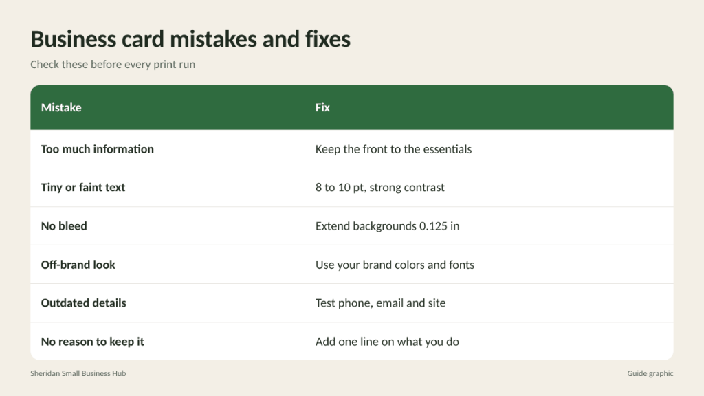
A standard US business card is 3.5 by 2 inches. That is a small canvas, and trying to fit a full service list, three phone numbers, every social profile and a tagline onto it makes everything harder to read. When a card is crowded, the eye has nowhere to land, and the one detail the reader wants (usually your phone or email) gets lost.
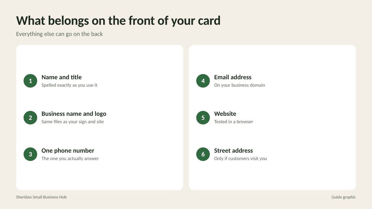
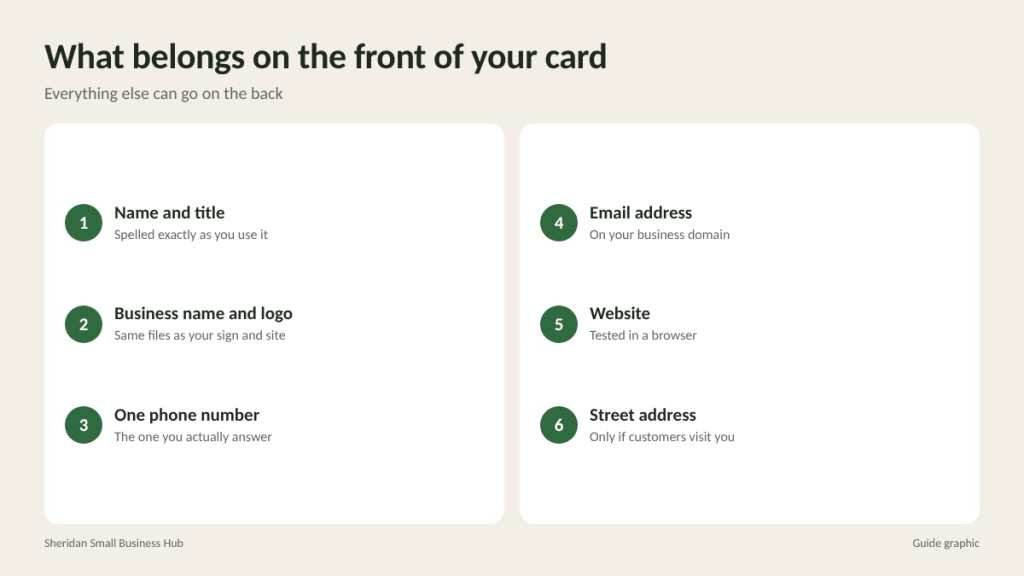
The fix: decide what the reader must be able to do after meeting you, then include only what supports that. For most small businesses, that means:
- Your name and title
- Business name and logo
- One phone number (the one you actually answer)
- Email address
- Website
- Street address only if customers visit you
Social handles, a short services line or a QR code can go on the back. Leave white space. It is not wasted; it is what makes the important lines readable.
Mistake 2: Text that is too small or too faint
Light gray text on a white card or thin script fonts at a tiny size might look elegant on a screen, where you can zoom in. On paper, in a dim restaurant or a parking lot, they are unreadable. Many readers are also holding the card at arm’s length or do not have their glasses handy.
The fix: keep contact details at roughly 8 to 10 point in a clean, simple typeface, and use strong contrast, such as dark text on a light background. Save decorative fonts for your name or logo, never for phone numbers or email addresses. Print a test copy on an office printer at actual size and read it at arm’s length before you approve the design.
Mistake 3: Ignoring bleed and safe margins
Business cards are printed on large sheets and cut down. The cutting is very accurate but not perfect, so a design that runs right to the edge can end up with a thin white sliver on one side, and text placed close to the edge can get trimmed.
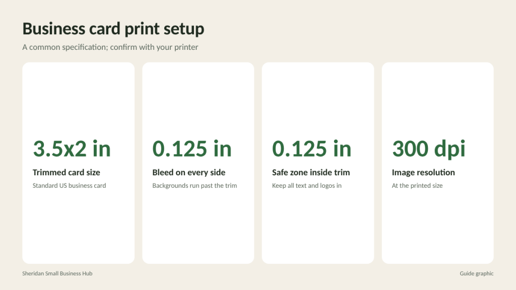
The fix: ask your printer for their exact specifications. A common setup is:
- Bleed: extend background colors and images about 0.125 inch beyond the trim line on every side.
- Safe zone: keep all text and logos at least 0.125 inch inside the trim line.
- Resolution: use images at 300 dpi at the printed size.
With a 0.125 inch bleed on each side, your file for a 3.5 by 2 inch card becomes 3.75 by 2.25 inches (3.5 + 0.125 + 0.125 = 3.75, and 2 + 0.125 + 0.125 = 2.25).
Mistake 4: A card that does not match your brand
If your storefront sign is navy and gold, your website uses a clean sans-serif font and your card is bright green with a cartoon font, people will not connect the card to your business a week later. Inconsistency also signals that a business is less established than it might be.
The fix: use the same logo file, color values and fonts you use everywhere else. If you have a brand guide, follow it. If not, write down your two or three main colors and one or two fonts now, and use them on every printed piece from here on. Note that colors can shift between screen and print, so request a printed proof if exact color matters.
Mistake 5: Outdated or wrong details
An old phone number, a former address, a website that redirects or an email at a personal domain all cost you contacts. A card with a crossed-out number written over in pen looks worse than no card at all.
The fix: before every print run, call the number, send a test email and type the website into a browser. Check spelling of your name, street and suite number. Ask someone outside your business to proofread, because it is easy to read what you expect to see. Order quantities you will use within a year or so, so you are not stuck with 1,000 cards when your details change.
Mistake 6: No reason to keep the card
Many cards say who you are but not why someone should call. A recipient who meets ten people at an event may remember the face but not what the business does.
The fix: add a short line describing what you do in plain words, such as “Residential HVAC repair, same-day service” or “Bookkeeping for restaurants.” Consider using the back for something useful: a short list of services, appointment reminder lines, a QR code to book online or to your reviews page. Make sure any QR code is large enough to scan easily (test it with two different phones) and points to a page you control.
Mistake 7: Cheap paper and poor finishing
Thin, flimsy stock bends in a wallet and feels like an afterthought. On the other hand, some finishes cause practical problems. A heavily glossy card can be hard to write on, which matters if you jot appointment times or notes on the back.
The fix: choose a heavier card stock that feels substantial in the hand. A matte or uncoated finish is easy to write on and reduces glare. Gloss works well for photo-heavy designs. Specialty touches like rounded corners, spot gloss or foil can help a card stand out, but only add them when the basics are already right.
A five-minute checklist to catch business card design mistakes
Run through this list before sending any file to print:
- Name, title and business name are spelled correctly.
- Phone, email and website have been tested today.
- Contact details are at least 8 point with strong contrast.
- Background extends into the bleed and text sits inside the safe zone.
- Logo and images are high resolution, not copied from a website.
- Colors and fonts match your sign, website and other materials.
- One short line explains what you do.
- The back is used for something helpful, or intentionally left clean.
- Any QR code scans correctly on two phones.
- You have seen a physical proof or test print at actual size.
Getting the most from the cards you print
Even a well-designed card does nothing sitting in a box. Keep a few in your wallet, car and laptop bag. Hand them out with a sentence that gives context, like “Call this number if your AC acts up this summer.” After an event, follow up with people whose cards you collected within a couple of days, while you are still fresh in their memory. And when you reorder, take a moment to ask whether anything on the card should change.
Frequently asked questions
What is the standard business card size in the US?
The standard size is 3.5 by 2 inches. With a typical 0.125 inch bleed on all sides, the design file is 3.75 by 2.25 inches.
Should I put my photo on my business card?
It can help in personal-relationship fields like real estate or insurance, where people need to remember a face. For most other businesses, a clear logo is enough.
Are QR codes on business cards worth it?
Yes, if the code leads somewhere useful, such as booking, reviews or a contact file, and it is large enough to scan. Always test it before printing.
Is a double-sided card worth the extra cost?
Often, yes. The back gives you room for services or a QR code, which keeps the front clean and easy to read.
Ready to print a better card?
Bring your print-ready file to The Postal Spot’s printing and copy service in Houston and check a proof before your full run.