
You designed a flyer that looks perfect on your screen, sent it off to print, and got back a message saying the file “isn’t print ready.” Or worse, it printed, and the logo looks fuzzy, the edges have thin white strips and the deep blue came out purple. These problems are almost always caused by a few technical settings, not by the design itself. Once you know how to make a file print ready, you can avoid delays, reprints and wasted money on every job.
This guide explains the core terms printers use (bleed, trim, safe zone, resolution and color mode), shows you how to calculate the right file size and pixel dimensions, and gives you a checklist to run before exporting. It applies to flyers, posters, postcards, brochures and most other small business print jobs.
The three lines every print file has
Picture three rectangles nested inside each other. Understanding them solves most print problems.
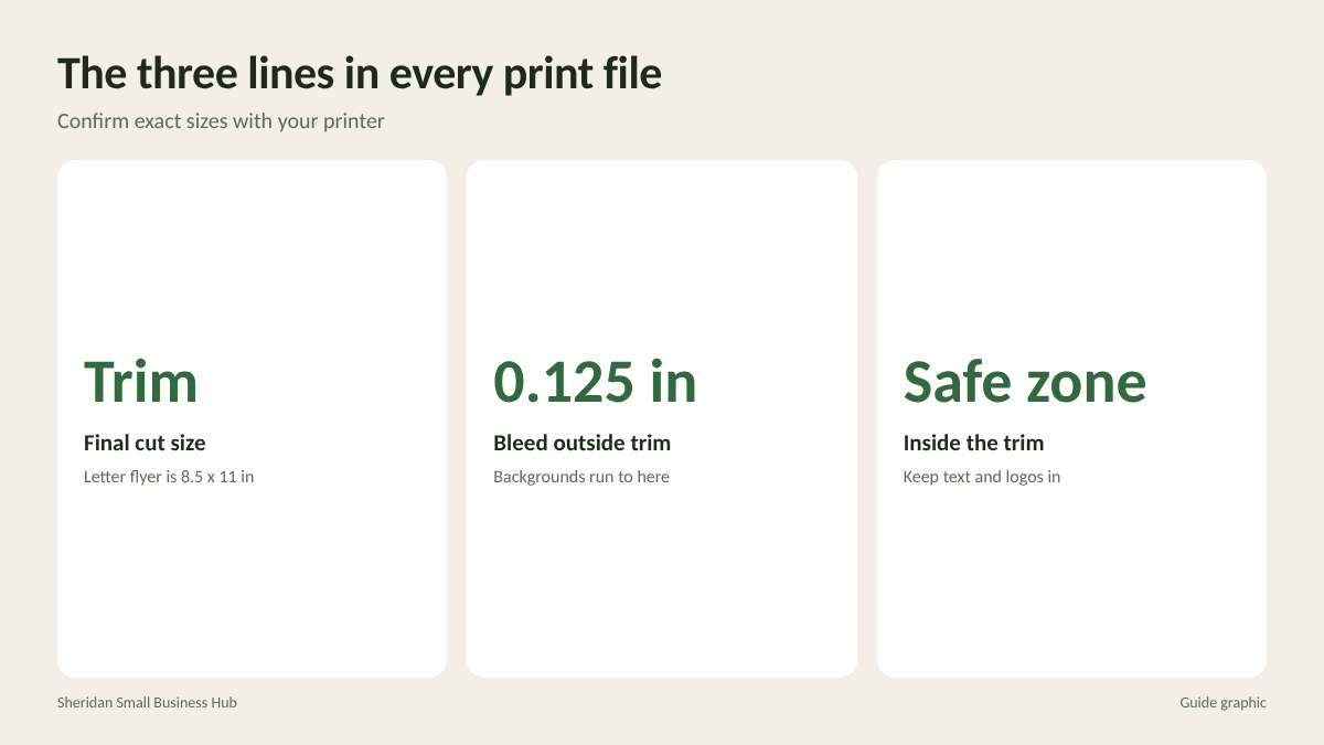
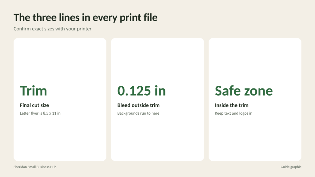
- Trim line: the final size of the printed piece, where the cutter blade goes. For a letter-size flyer, that is 8.5 by 11 inches.
- Bleed line: an extra margin outside the trim line where backgrounds and images extend. It is trimmed off after printing.
- Safe zone: an inner margin inside the trim line where all important text and logos should stay.
Why all three? Printing happens on larger sheets that are cut down, and every cutter has a small amount of tolerance. Bleed makes sure color runs all the way to the edge even if the cut is slightly off. The safe zone makes sure nothing important gets sliced off.
Bleed: how much and how to add it
The most common bleed in the US is 0.125 inch (1/8 inch) on every side, but large format items such as banners and signs can need more. Always check your printer’s specifications.
Adding bleed changes your document size. Add the bleed to each side, so twice the bleed to each dimension:
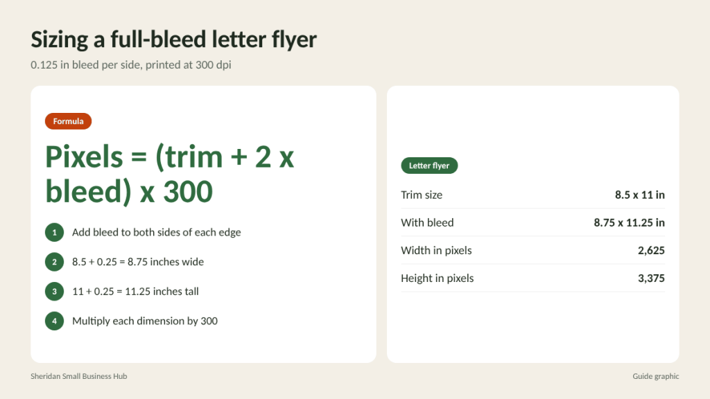
- Letter flyer: 8.5 + 0.25 = 8.75 inches wide, and 11 + 0.25 = 11.25 inches tall.
- 5 x 7 inch postcard: 5.25 by 7.25 inches.
- 18 x 24 inch poster: 18.25 by 24.25 inches.
Anything that touches the edge, such as a background color, a photo or a border stripe, should extend all the way to the bleed line. If your design has a plain white background and nothing touches the edge, bleed is less critical, but many printers still prefer it included.
Avoid thin borders near the edge
A narrow frame running around the edge of a design will look uneven if the cut shifts even slightly. Either make the border thick enough that small variations do not show, or leave it out.
Safe zone: keep text away from the edge
A common safe zone is at least 0.125 inch inside the trim line, and 0.25 inch is more comfortable for larger pieces. On a letter flyer with a 0.25 inch safe margin, your text should sit within an area of 8 by 10.5 inches (8.5 – 0.5 and 11 – 0.5). For folded pieces like brochures, also keep text away from the fold lines so words do not disappear into the crease.
Resolution: why images look blurry in print
Screens look sharp at relatively low resolution, but paper reveals every missing pixel. For most printed pieces viewed up close, such as flyers, brochures, postcards and business cards, the standard target is 300 dpi (dots per inch) at the final printed size.
To find the pixel size you need, multiply inches by 300:
- A full-bleed letter flyer (8.75 x 11.25 in): 8.75 x 300 = 2,625 pixels wide, and 11.25 x 300 = 3,375 pixels tall.
- A 4 x 6 inch photo on that flyer: 1,200 x 1,800 pixels.
A few important points:
- You cannot add resolution later. Changing a 72 dpi web image to 300 dpi in software does not add detail; it only makes the file bigger.
- Do not grab images from websites, including your own, as they are usually optimized for screens and too small for print.
- Large format is different. Banners and posters viewed from several feet away can often use lower resolution at full size. Ask your printer what they recommend for the size and viewing distance.
- Logos should be vector files (such as AI, EPS, SVG or a vector PDF) whenever possible, because vectors stay sharp at any size.
Color mode: RGB vs CMYK
Screens create color with light in RGB (red, green, blue). Most printing uses ink in CMYK (cyan, magenta, yellow, black). Some bright RGB colors, especially vivid blues, greens and oranges, cannot be reproduced exactly with ink, so they shift when printed.
- Design in CMYK, or convert to CMYK before export, so you see a closer preview of printed color.
- If your brand uses a specific color, ask your printer whether they can match it and request a proof.
- For large areas of black, ask your printer about their preferred “rich black” mix. Plain 100% black ink alone can look slightly gray on big solid areas.
- Keep small body text in plain black so it prints crisply.
Fonts and file format
If the printer does not have your fonts, text can shift or swap to a default typeface. Avoid that by:
- Exporting to PDF with fonts embedded, which most design programs do by default with print presets.
- Converting text to outlines for logos or headlines if your printer requests it. Keep an editable copy for yourself.
- Using a print PDF preset, such as PDF/X, if your software offers it, and checking the box to include bleed and, if requested, crop marks.
PDF is the safest format for almost every print job. Avoid sending Word documents or PowerPoint files for professional printing when you can, because layouts can shift between computers.
How to make a file print ready: the pre-flight checklist
Run through these points before every export:
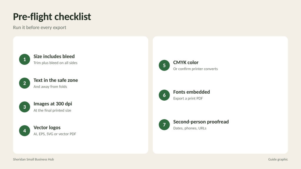
- Document size equals trim size plus bleed on all sides.
- Backgrounds and edge images extend fully into the bleed.
- All text and logos sit inside the safe zone and away from folds.
- Every image is at least 300 dpi at its printed size (or as your printer advises for large format).
- Logos are vector files.
- Document is in CMYK, or you have confirmed your printer converts RGB files.
- Fonts are embedded or outlined.
- Exported as a high-quality print PDF with bleed included.
- Spelling, phone numbers, dates and URLs are checked by a second person.
- File name is clear, such as “SpringSale_Flyer_8.5x11_bleed_v2.pdf.”
What to send along with the file
A good file goes further with a short note. Tell the printer the finished size, quantity, paper or material, single or double-sided, any folding, and your deadline. If the job has a front and back, name the files or PDF pages clearly so they are not swapped. Mention any brand colors you need matched. These details prevent the back-and-forth emails that delay jobs.
Always look at a proof
A proof is a preview of how the job will print. A digital proof checks layout, trimming and text. A printed proof also checks color and paper. For anything with important brand colors or a large run, a printed proof is worth the extra time. Look at it in good light, check every edge, and read every word one more time.
Frequently asked questions
What is bleed in printing?
Bleed is extra image area beyond the final cut size, usually 0.125 inch per side, so color runs to the edge after trimming.
What resolution should a print file be?
For pieces viewed up close, 300 dpi at the final printed size. Large banners and posters may need less; ask your printer.
Do I need to convert my file to CMYK?
It is the safest approach for color accuracy. Some printers convert RGB automatically, but colors may shift.
Can I print from a Word document?
Often, for simple jobs, but export it as a PDF first so the layout and fonts stay in place.
File ready to go?
Send your finished PDF to poster, banner and flyer printing at The Postal Spot in Houston and review a proof before the full run.